
I have been working on a secret project since last year, but I will be able to show more artwork soon. 🙂
I have been working on a secret project since last year, but I will be able to show more artwork soon. 🙂


So I decided it was time for a new showreel, to reflect what I have learned and showcase some of the work I have done over the past year. 🙂
A few words about Gumball –
Because the episodes I worked on haven‘t aired yet, I am only allowed to show a few seconds of them, and only in playblast version. We would usually get a rough storyboard with the characters and a basic sketch of the background or a photo, if it’s a re-use from an old show.
Then I would use Adobe Photoshop, Adobe after Effects and Autodesk Maya to create a more fleshed-out version of the background, which would have realistic perspective, all the requered elements for a final background, and cut nicely with all the other shots in the sequence. This layout would be sent to the awesome animation team for animation, and to the amazing background people for finalising.
Sometimes the layouts would be a re-use, or edit, of an old background; sometimes they would be completely new images which would have to be matte-painted. This reel consists entirely of completely new images, which were created for the new episodes of the show.
There are several locations in which the action takes place, and each of them was designed and painted in Adobe Photoshop. This was the part of production which took me the most time, and from which I learned quite a lot as well, as I have never done a fully coloured, finished background before this project.
I wanted the short to be very colourful and have a nice atmosphere, so I spent quite a lot of time trying to get the colours right. Each shot was sketched out in the animatic of the film, then a black-and white layout version was made, and finally, the final coloured background was painted on top of it.
After that, the shot was composed in Adobe After Effects, and some small effects like smoke, light and shadow were added to enhance the visuals.What follows are several of the backgrounds I created for “Small and Big’, establishing the main locations that the short film takes place.
.
Intro shot final composite:

.
One of the fist establishing shots of the film, starting with the final composite, the Adobe Photoshop painting and finally – the layout. This shot shows the small village where the story takes place, and the homes of the 3 main characters – the Small guy, the Big guy and the Old guy. The story is set in the beginning of the century, before electricity was widely used, so the village is suppose to have a very rural feel to it. The Big guy’s shop was designed to appear as the newest building in the village, and so it doesn’t quite fit in with the other older looking brick – and – straw buildings.


Second establishing, again, starting with the final composite, followed by the Adobe Photoshop painting and finally – the original, black and white layout sketch. This shots presents the shops of the 2 main characters, which were designed to resemble the characters themself, and to establish the opposing philosophies and origins of the 2 characters. The Big guy’s shop is more modern, using electricity, brightly coloured and build with new materials, while the small guy’s shop is very old-fashioned, closer to earth in colouring and relying on a furnace and chimney.


The shop of the small character, Photoshop painting followed by layout sketch. This shop is build out ot natural materials, since the character lived in the small village all his life. Since he doesn’t have electricity, he has to rely on old-fashioned methods of providing light, like the old gas lamp.


.
The shop of the big character, painting and layout. The Big character is a more modern type of person, and is wealthier than the Small one. His shop has electricity and is brightly coloured, opposing to the warmer, more natural colours of the small guy’s shop.


As my graduation film had a pretty extensive pre-production process, I will divide the posts related to it in 2 – characters, and layouts and background.
The characters in “Small and Big” were supposed to be 2 complete opposites – a small guy, and a very big guy, as seen from the title. They were going to be 3d characters, but I did extensive hand-drawn sketches of them before we settled on the final designs. The ones posted here are mostly the middle development to final period, where I have decided on their basic shape and silueth, but am still trying to clean up the main idea.
Some of the uploads are taken straight out of the project art-book, so they have a numbering and date.
Small guy:


Big guy:


And the old guy:

You can see how the models looked like withouth props and 3d hair at the end of my old character desigh portfolio:
A very small post, for a small project. ‘Unlucky’ was anothe project from 2010. Both “Unlucky” and “Taking Flight” were for the 1st semester of the second university year, so we began working on them in the beginning of October and handed them in December.
The brief for this project was simple – choose one of the provided 21 seconds long tracks, and make an animation to go with it. We also had to work alone on this project. I had very little time to spare, whille working part-time to suport myself and developing “Taking Flight”, so my pre-production stage was very short. I just did a few quick sketches of the main character, choose one of them and then started working on the animatic and basic animation.

Several fast sketches I did before choosing one for the main character.

The final desigh of the main character, a nice but unlucky homeless guy.
The background design was very simple as well, as the short consisted of 2 backgrounds.

The basic sketch used as a basis of the main background.
I am currently re-animating the short, as I had to do the entirefilm in about 6 weeks, so the animation on the original is extremely limited. As with my other projects, I will upload the video as soon as I can. Still, nothing hurts to show one of the final frames.

One of the final frames of the short film, with the finished character and background.

“Taking Flight” was a short project for my 2nd year at university, back in 2010. The brief was to choose a story, make a loose adaption of it, design it and shoot it under a rostrum camera using only analog means. We weren’t allowed to use any computers for post-production or animation, besides for editing and color correction. What made the project even more interesting was that we each had only 2 weeks of pre-scheduled time under the rostrum camera, so everything had to be ready for shooting on a pretty tight schedule.
On this project I worked with my fellow student Rhubab Shakir, who did a lot of the animation and the adapting of the story. I was just beginning to take interest in pre-production and design, so I decided to focus on designing the visual style of the short. We decided to make a loose adaption of Edgar Alan Poe’s “The man from the crowd”, filming using paper cut-out animation.
Rhubab though it would be interesting to use birds to tell the story, and I quickly agreed with her. Adapting Edgar Alan Poe, using birds as characters and a raven as a protagonist was a cool idea and it also played homage to one of the author’s most iconic works.
In the design of the characters, I was mostly inspired by shadow-puppet theater. The story was pretty dark, so I focused on using a limited color scheme, just black and white, and developing strong, different silueths, which would show the different bird’s social standing.

These were the higher ranking birds of the tree, which live closer to the top.

The first few versions of the upper class birds. The desigh was still very simple here, and the final ones have a more ornamental feel to them. The work title of the film at that time was “Ravens”. One of the 2 dated pieces of concept art from the project.

Several versions of the middle-class birds, which build nests.

Several versions for the worker birds, which are woodpecker and builders. They build and strenghten the branches for the house-birds.

The scale of the varouas birds living in the tree.
Having a limited time to shoot, the film is set in one place – a giant, floating tree. I used a little bit more colors in making the tree, but still tried to keep it pretty dark and simplistic. As I said, I was just starting to learn how to design stuff for animation, and looking back at it, I think I made the tree a little bit too active and the characters sometimes get lost in it.

Several versions of the final concepts for the background.

The final version of the main background, which was used for all the wideshots in the film.
When the whole film was designed, I used the basic set and made a very detailed storyboard. This would save us time in the shooting later on, and I would also use it to paint the backgrounds for the close-up shots and figure out the scale of the models in the various shots.
Everything so far was created in Photoshop, and was later scanned, printed, cut apart and assembled into puppets. We managed to shoot the entire 3 minute film in exactly 2 weeks.
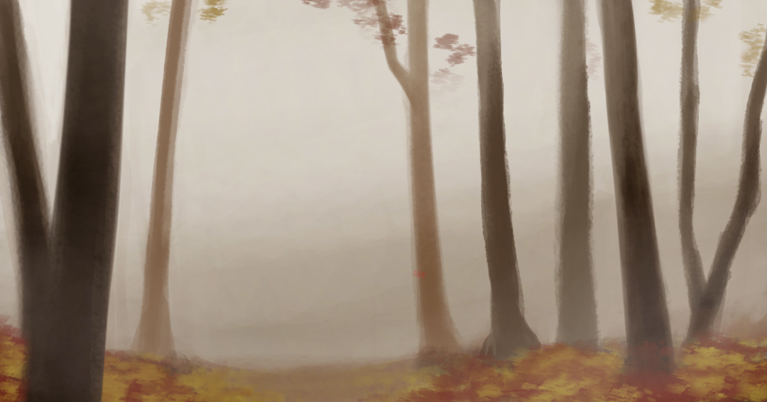
I officially started the pre-production phase of my final year film today. So far, I have several ideas about a story and have decided to make it a combination between hand drawn backgrounds and 3d characters.
I have several visual experiments planned, and probably more will popup during development. I started today by doing a simple background test in Adobe Photoshop. The idea of the test was to start experimenting with emulating a more clasical, hand drawn – paint on paper look in Adobe Photoshop. The initial speed paint took me about an hour.
While working on thetest, I also decided to check how much changing the background would influence the mood of the picture. The original idea was for the forest to have a misty/early morning/rainy autumn look. I then used a brighter background, to achieve a more sunset/sunrise feel. This worked to some point because part of the trees are semi-transparent, so they take on the color of the background.

And finally, a plain white background with some mist, to indicate a more closer to winter feel for the test.

Overall, I am pleased with how this turned out. It is also the beginning of a long process, trying to figure out and develop the story, and also the look of my film which would help it tell the story in the best (or close to best possible) way.


